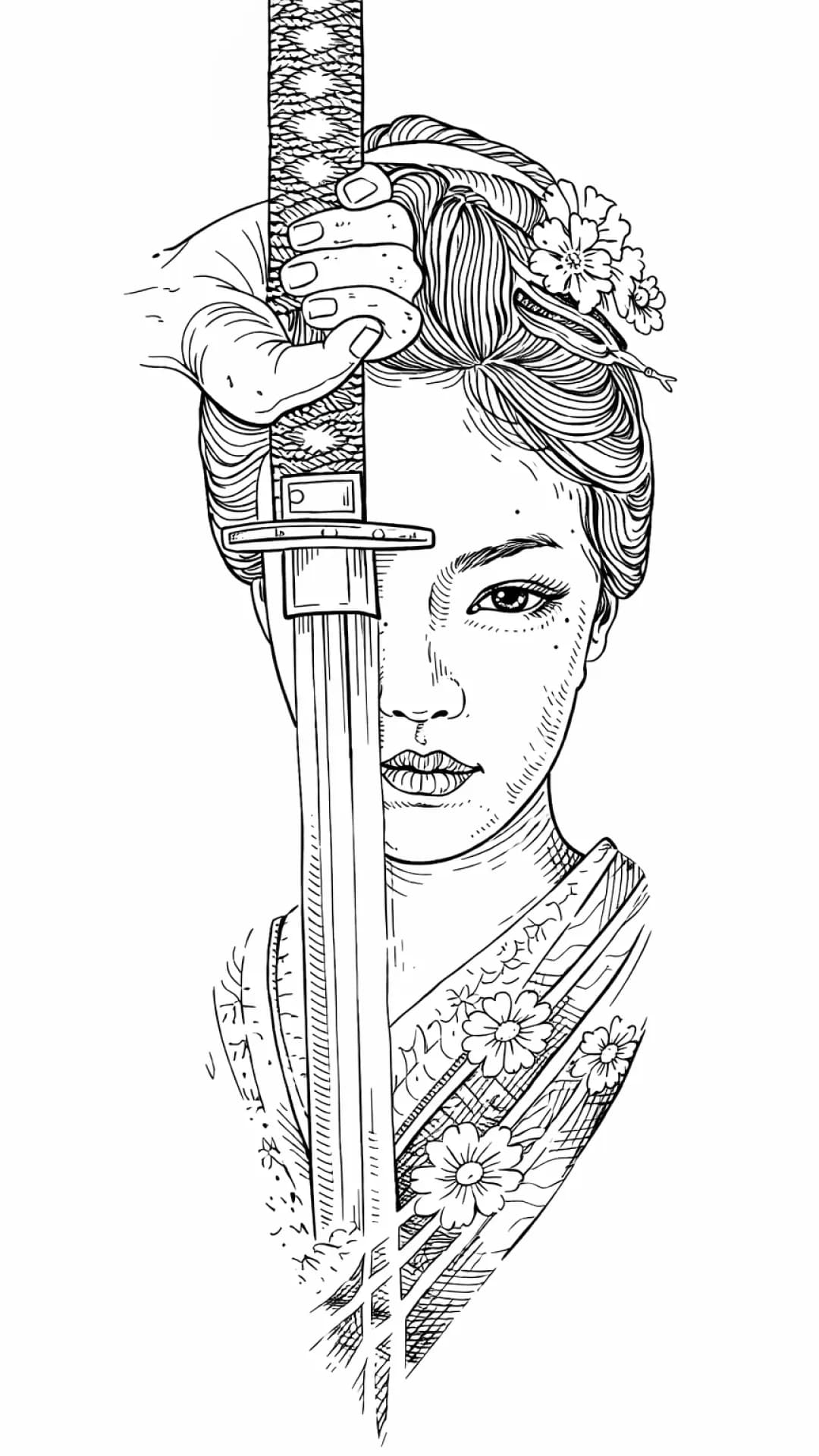
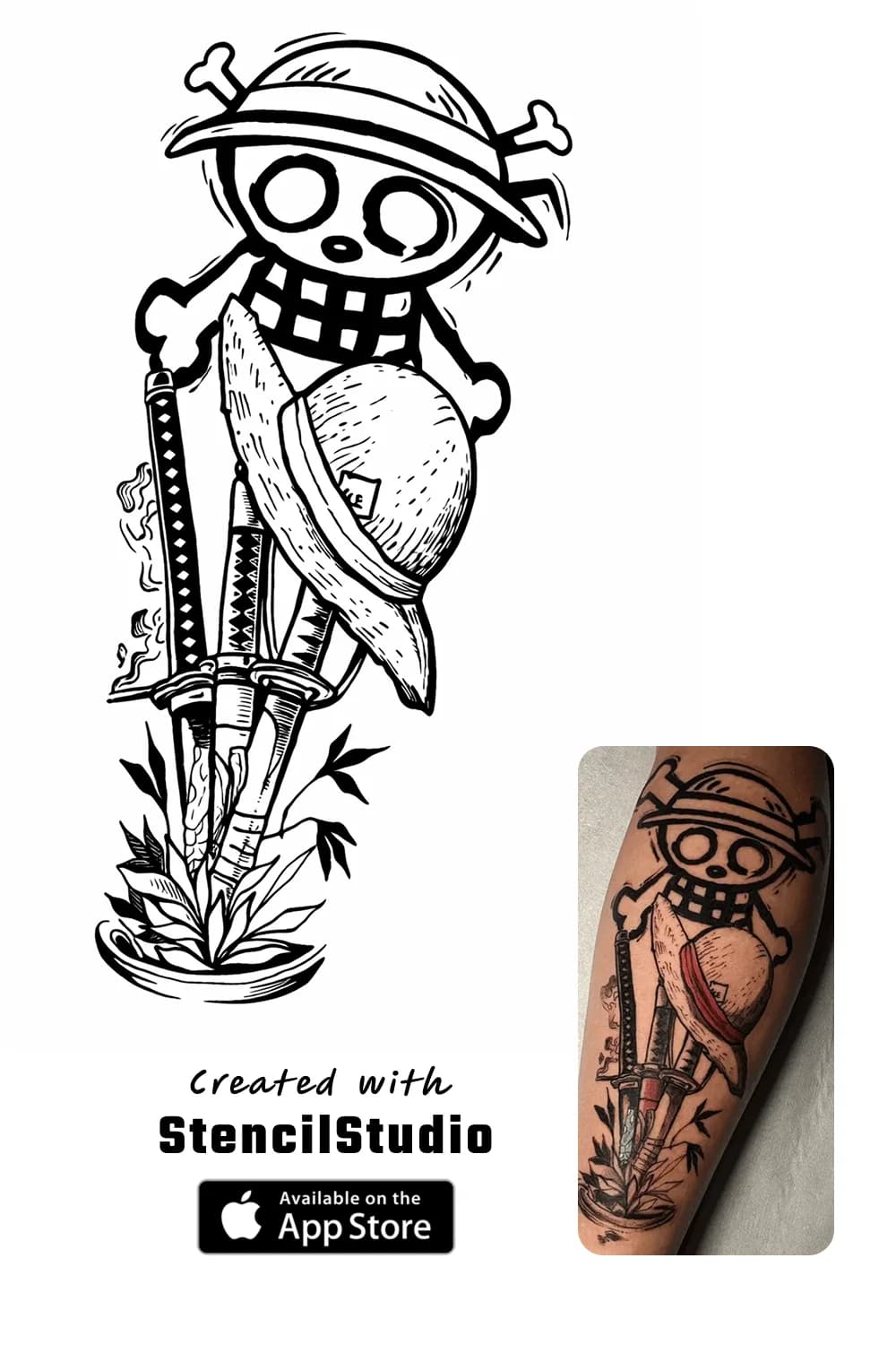
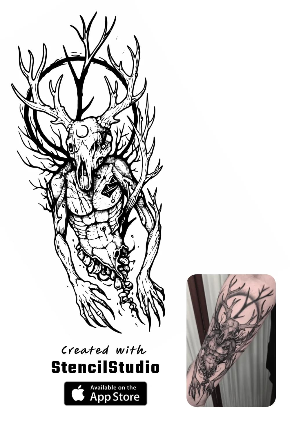
Back to Stencil Gallery

Skull Tattoo Stencil Group

Skull-based stencils are useful because they expose a common tension: artists want drama and internal structure, but the design still needs to survive transfer as a readable first-pass draft. This early skull set is small, but the two examples are distinct enough to compare bolder mass against more character-heavy internal structure. Use this page to see where skull imagery stays clear and where it starts to crowd.

2 examplesUpdated April 1, 2026Skulls
Skull tattoo stencil example featuring bold one piece skull linework
One Piece skull example focused on bold silhouette and darker illustrative massing.

What works: The dominant skull shape lands fast because the heavier outer read stays ahead of the interior accents.

Best for: Artists who want a darker, bolder skull read before later shading or texture choices.

Watchouts: Small inner fragments can pile up if the design is reduced too far for a tight placement.

Skull tattoo stencil example featuring deer skull figure linework
Deer skull figure example focused on structure, silhouette, and spacing around the antler form.

What works: The antler and skull relationship stays readable because the silhouette breaks remain clear instead of collapsing into one dark mass.

Best for: Medium placements where shape hierarchy matters as much as the darker illustrative mood.

Watchouts: Antler detail can become crowded if too many small turns are preserved at a reduced size.

Shape

Why skull stencils need silhouette discipline first

Skull designs often invite artists to keep too much inner texture too early. The better stencil-first move is to make sure the primary skull shape lands immediately before the design starts chasing cracks, ornament, or surrounding decoration. This set shows how much stronger the read becomes when silhouette wins first.

Detail Control

Where darker skull structure helps and where it muddies

Internal darkness and structure can make skull stencils feel dramatic, but only when the spacing stays deliberate. Once every cavity, contour, and ornament is preserved equally, the result gets heavier without becoming more useful. This is a good category for studying where contrast helps and where it simply crowds.

Application Notes

How to use skull references before final size and placement

Check whether the design still reads from the outer contour first, then look at the tightest internal cluster second. That is usually the fastest way to decide whether the stencil needs simplification before it reaches a curved placement or a smaller tattoo size. Skull imagery looks forgiving on screen, but not every dense read stays practical on skin.

More to Explore

Scan for silhouette strength before you care about tiny decorative details.

Compare what still reads clearly when the subject is reduced into stencil-first linework.

Use the commentary to spot where density helps and where it starts to collapse.

When a direction feels right, jump into the app, the samples page, or pricing.

Related Guides

Read the workflow behind this stencil category

Open blog

FAQ

Quick questions about this stencil collection

It helps you compare stencil readability, silhouette control, and detail density across 2 examples before you start drawing from your own references.

It is most useful for tattoo artists who want visual references for how this subject category holds up as stencil-first linework before transfer, placement, or final drawing decisions.

Once you know what reads clearly, move into the app workflow, open the samples page, or check pricing if you are ready for that part.

Use this workflow in the app

Turn darker reference ideas into cleaner stencil drafts

Use the skull examples to anchor what should stay bold, then open StencilStudio to generate and simplify your own draft faster.